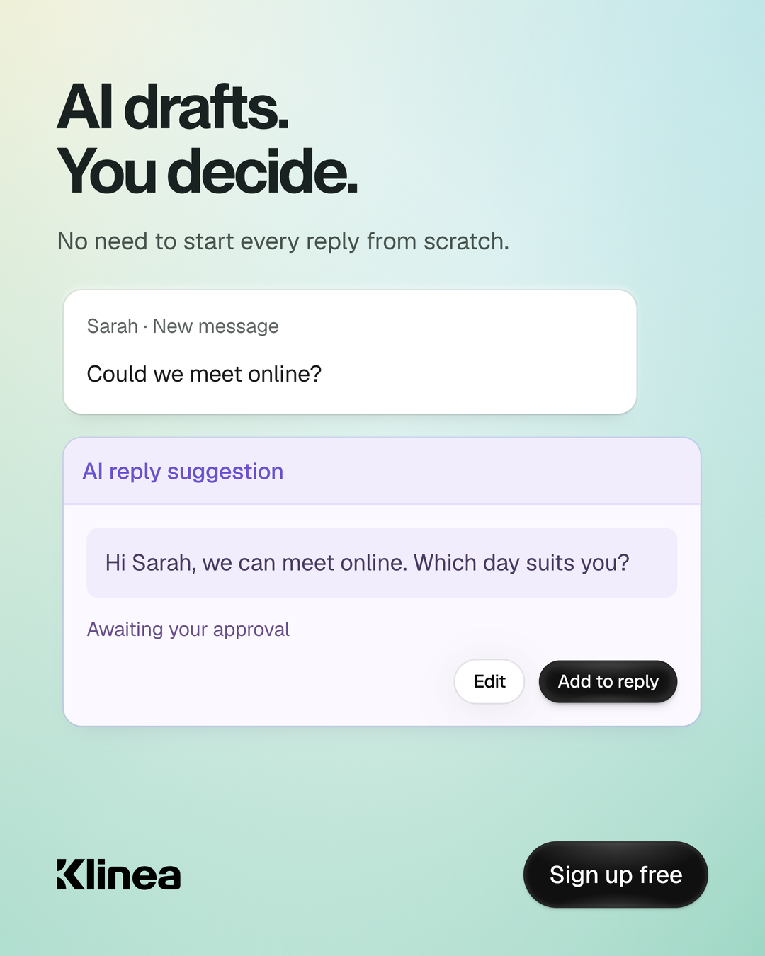
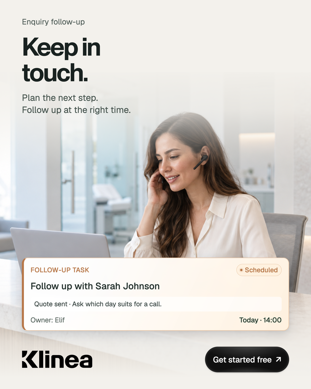
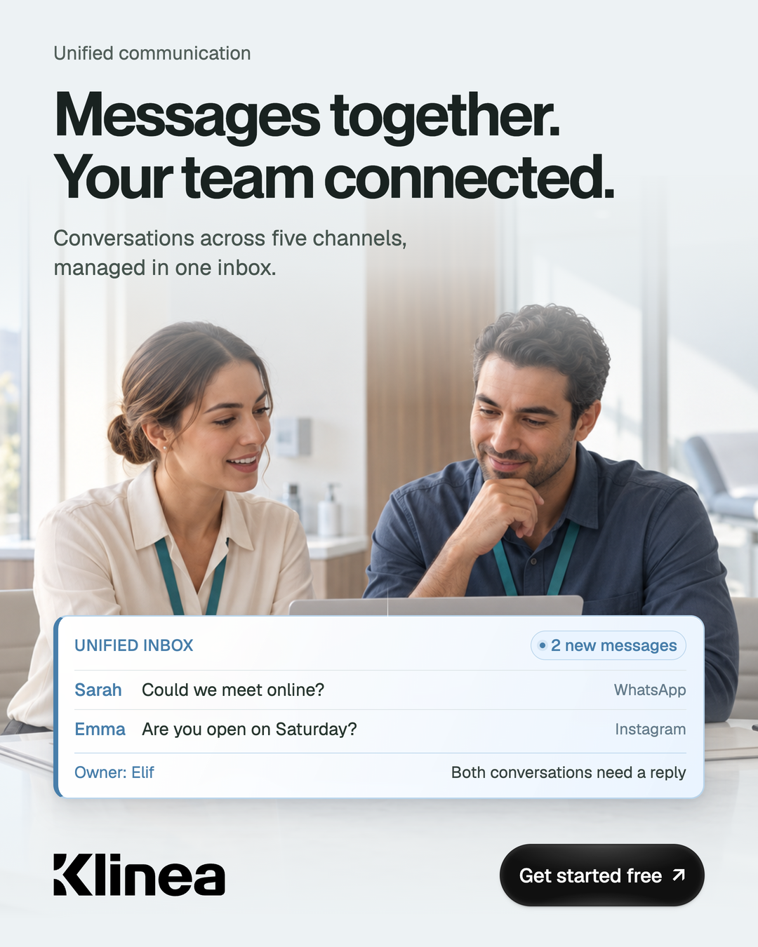
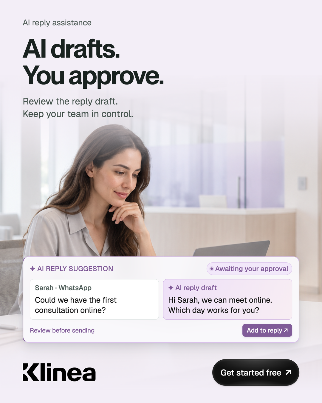
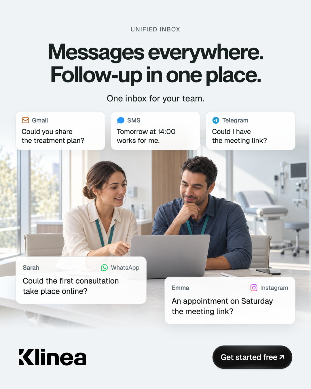
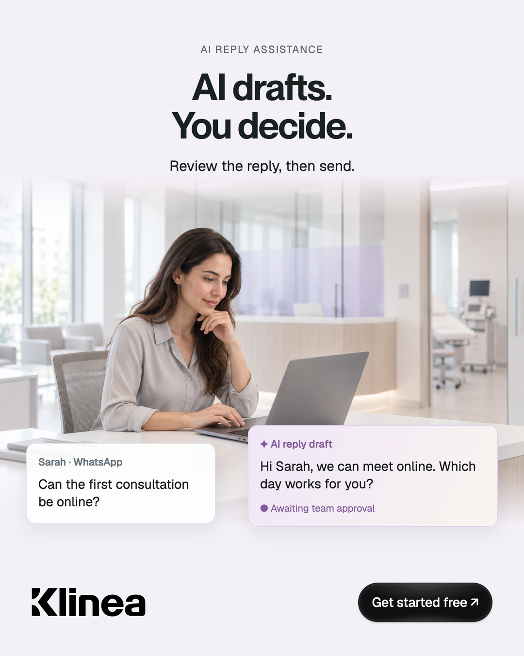
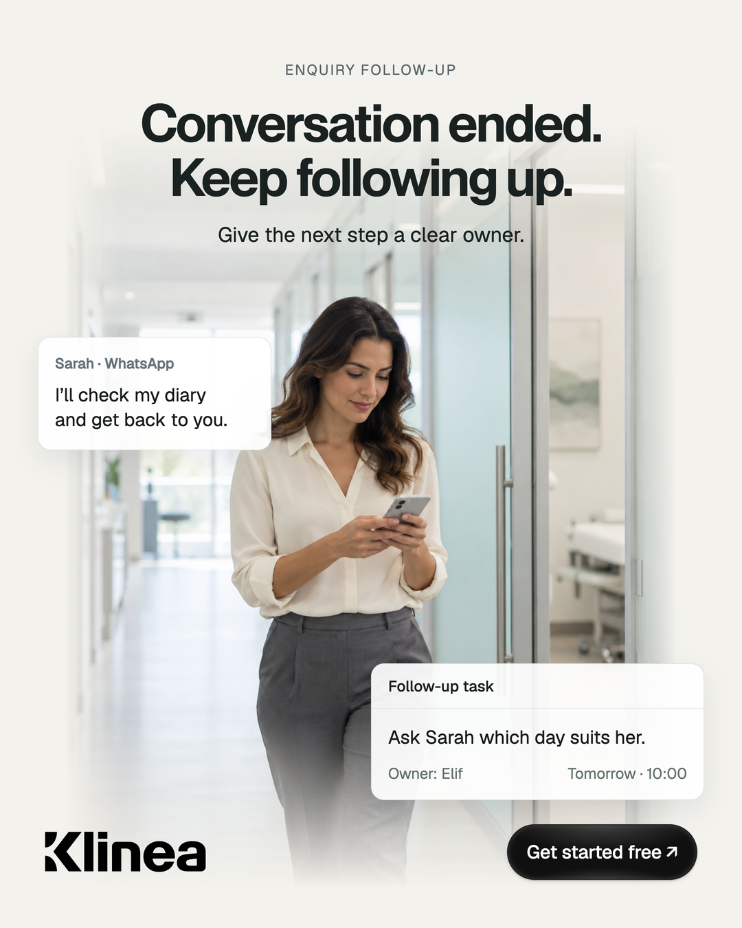
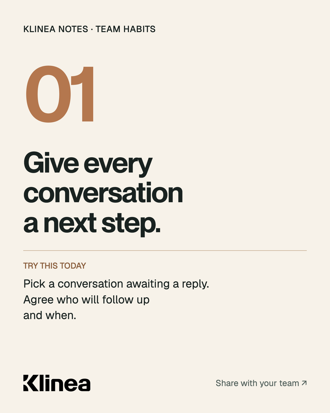
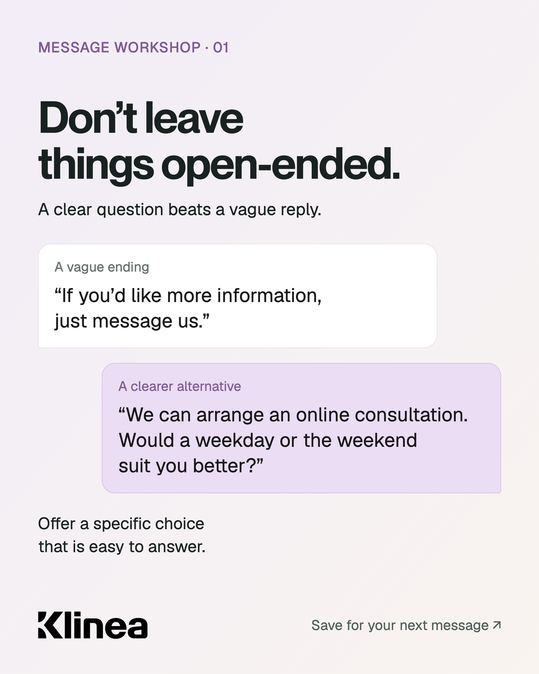
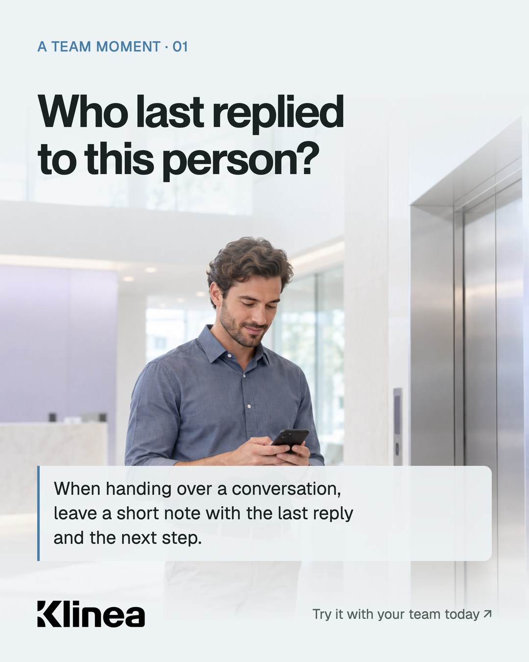
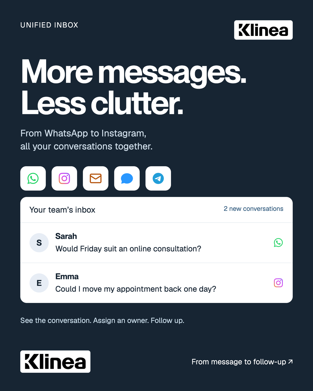
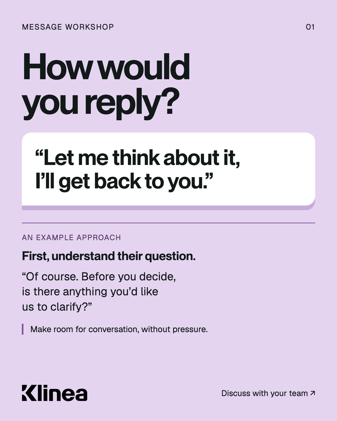
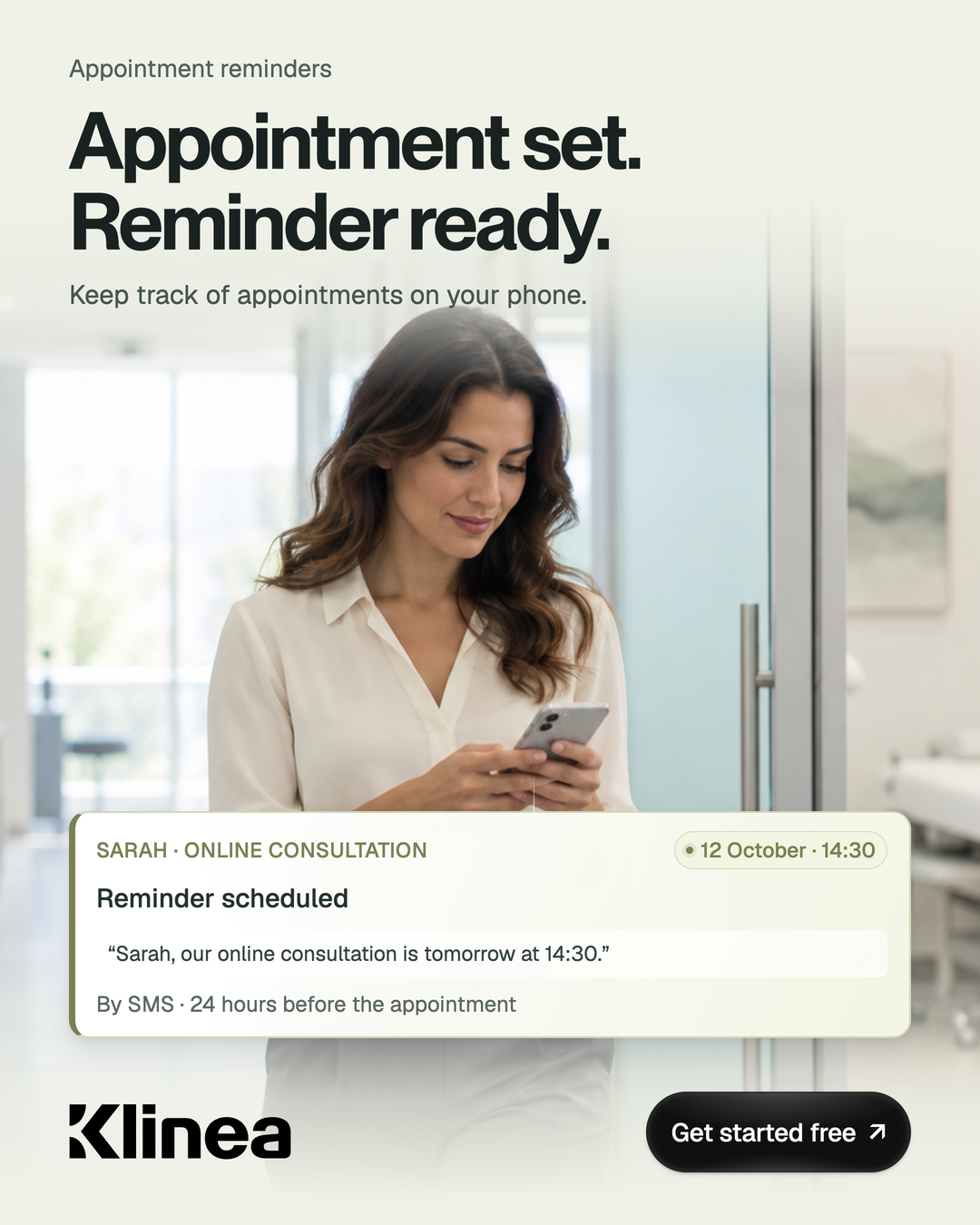
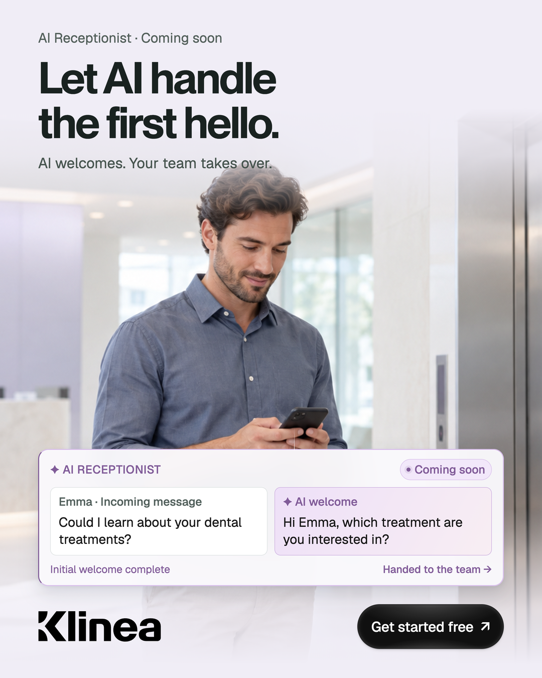
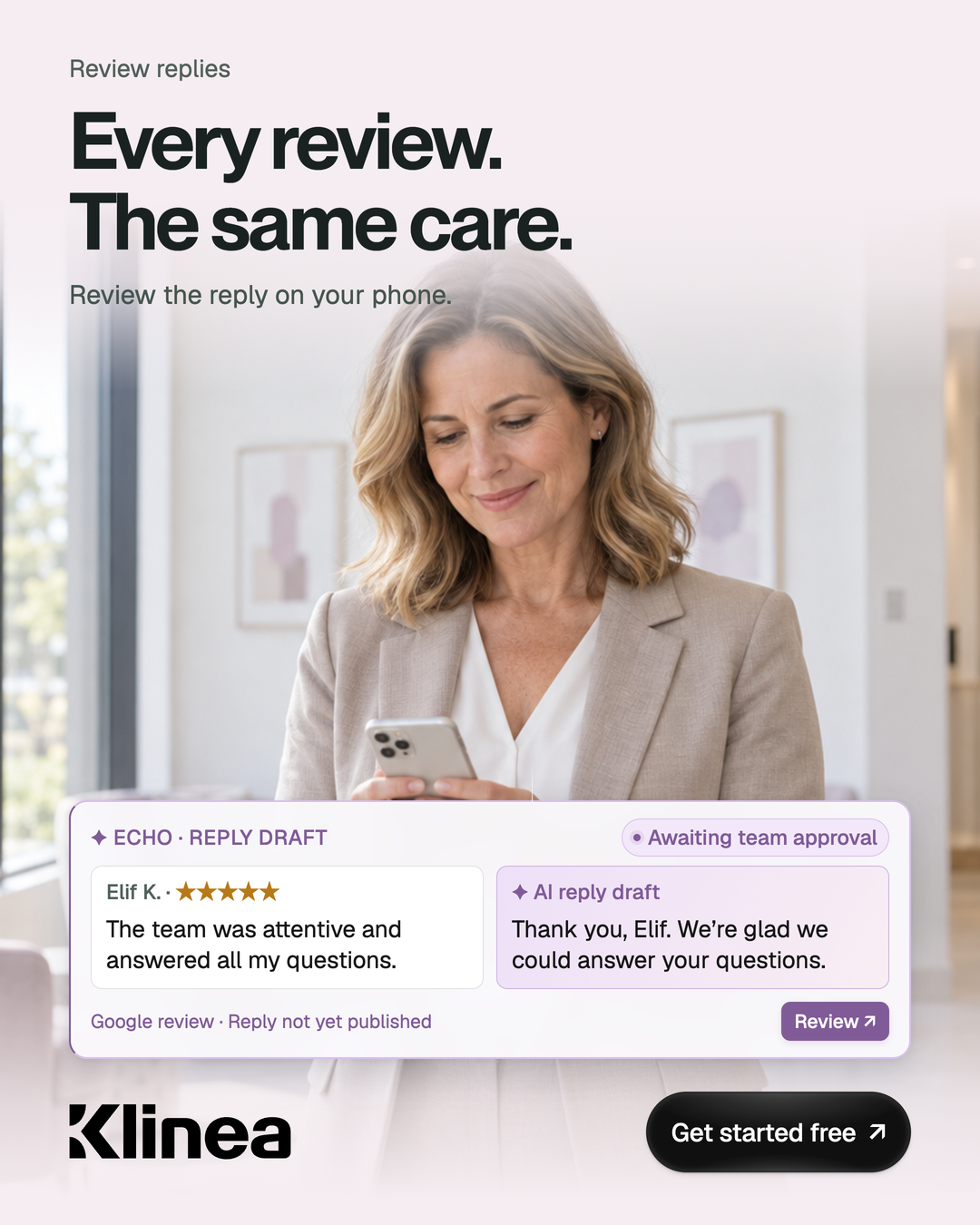
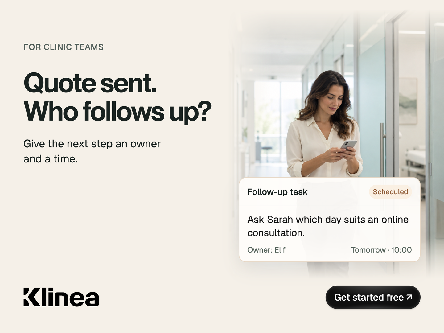
A question, an expectation, someone who wants to be heard before making a decision. Clinic communication begins with a reply; trust grows through the conversation that follows.
Klinea is built around that continuity: considering each person’s needs, the context of the conversation and the team’s next step together. Technology’s role is to simplify everyday work so people can give one another more attention.
Our identity carries the same idea. A Klinea wordmark that reads as one, generous space and controlled shades of blue. Calm, clear and confident. A brand that brings clarity to the next step in every conversation.
02 / Logos
Wordmark & K symbol
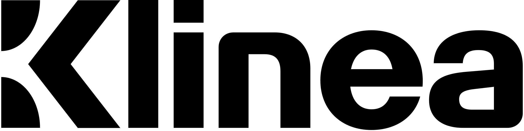
Preserve the spacing between K and “linea” and the original proportions. Do not recreate the logo with type.
Choose a mark and colour. The preview and downloads stay in sync.
Wordmark / Black
Wordmark
Use the complete wordmark when introducing Klinea. Keep the K and “linea” together.
Updated working edition in three languages. The site and banners share the same logo artwork. Backgrounds remain alternatives and campaigns are design studies. The online examples complement the downloadable working edition.
Use the white logo on a dark background with sufficient contrast.
Do not add shadows, outlines or embossing to the logo.
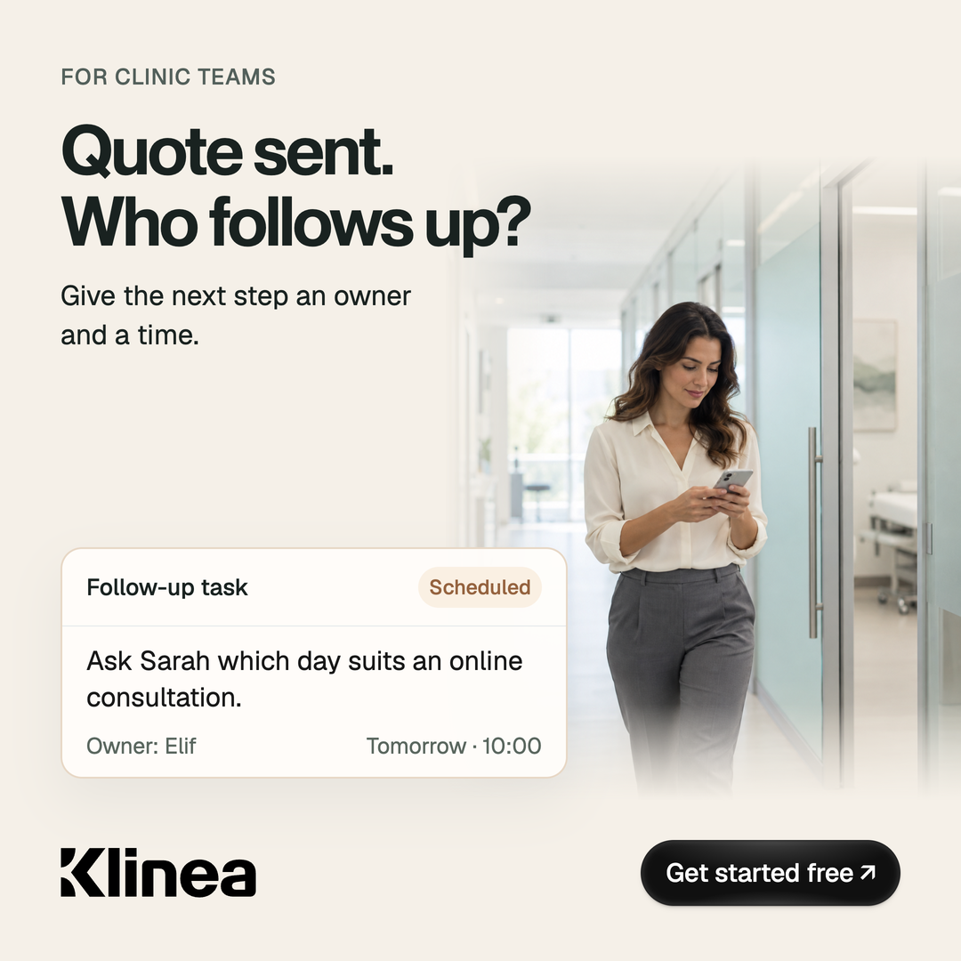
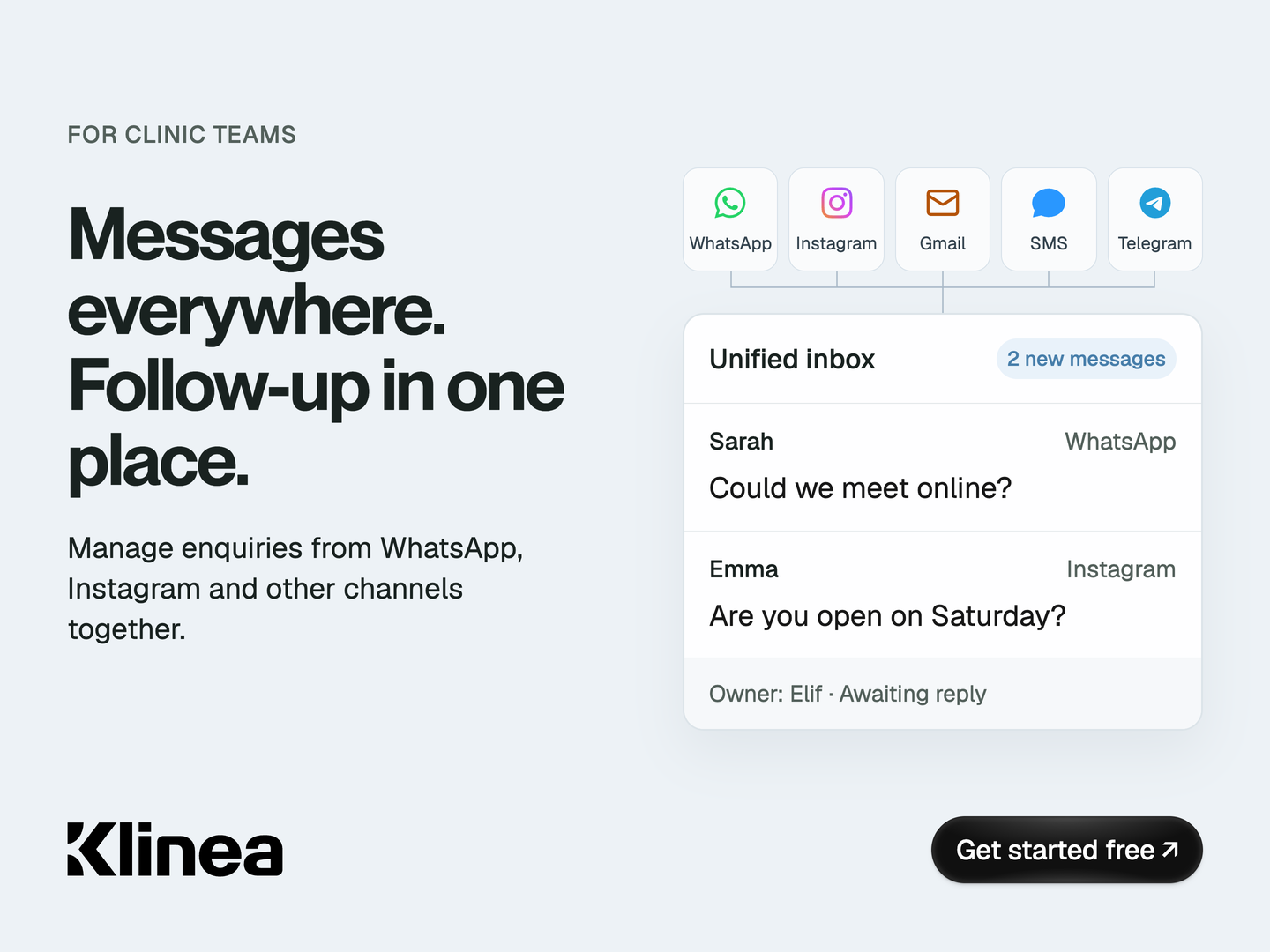
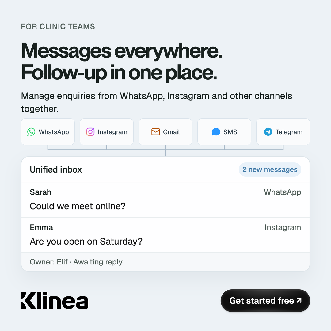
09 / Campaign artwork
Campaign artwork
26 images / 7 animations / 3 languages
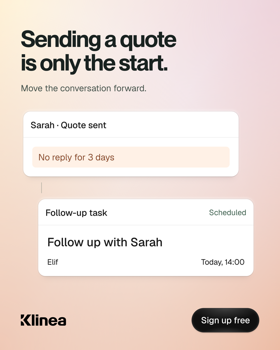
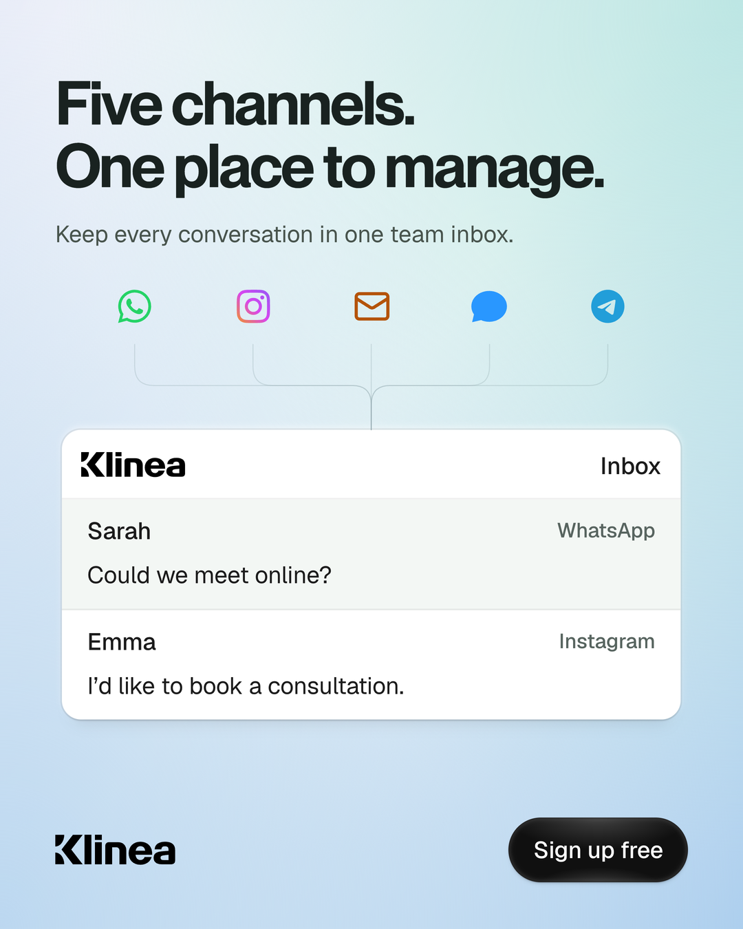
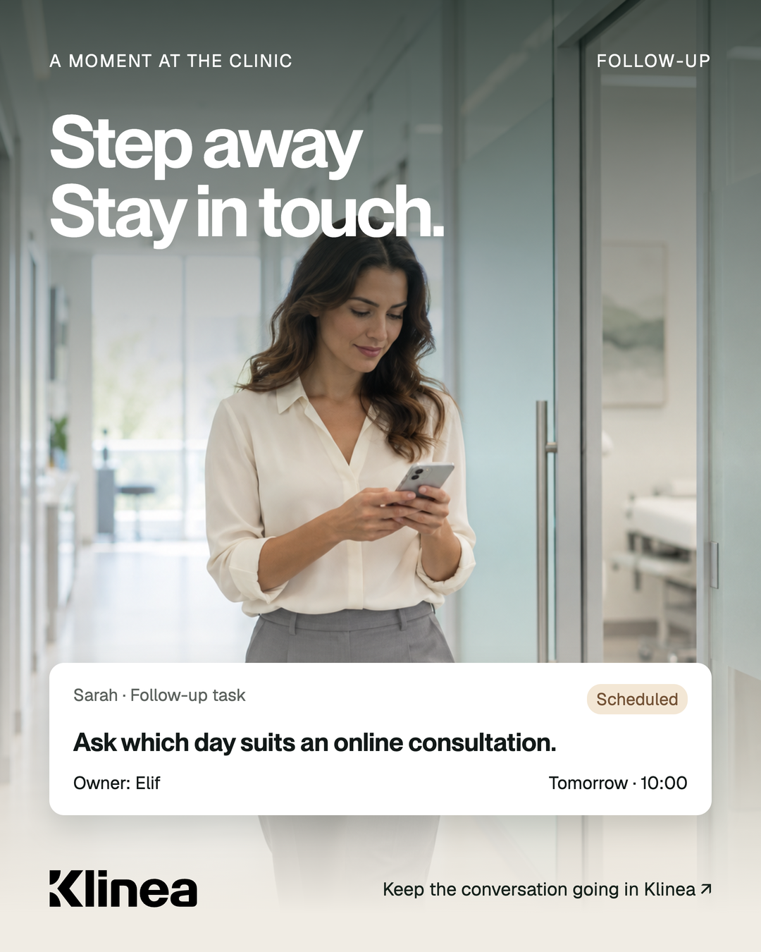
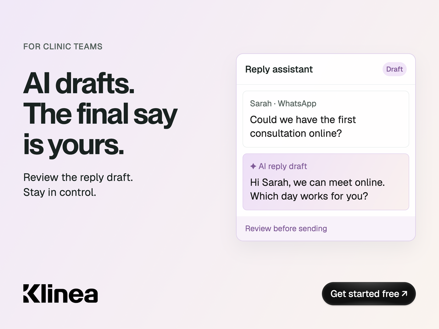
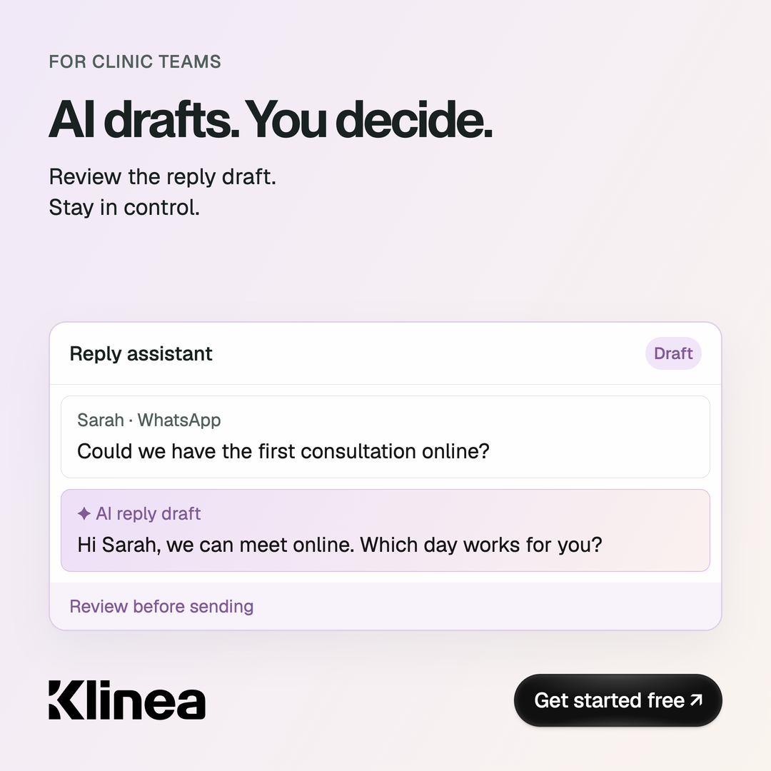
Explore our previously created advertising and content studies, organised into collections.
Design archive · Check the offer, CTA and product claims against your current campaign before publishing. Photography and interfaces may be illustrative.